Staying Creative When Designing for Accessibility
August 23, 2022
When we were hired by QualityLogic to design their new website, the goal was clear—create an accessible website that meets Web Content Accessibility Guidelines (WCAG) and complies with the Americans with Disabilities Act (ADA).
As the lead designer, I was excited and overwhelmed by the scope of the project. The site needed to follow specific accessibility guidelines, have an impactful design, and be flexible so it could grow in the future. The first step was research (and lots of it). I needed to understand the “why” behind the guidelines to do the best job possible with this site design.
Why is designing for accessibility in websites important?
We’ve all experienced the frustration of a slow-loading, difficult-to-read, and cluttered website. For some, those problems are nothing more than an inconvenience. For people with disabilities, these “inconveniences” may completely restrict them from using the website at all.
When you think about accessibility as a designer, the goal is to enable people with disabilities to perceive, understand, navigate, and interact with your design. Designers need to ensure equal access for all users by designing an experience that can be used by people with a diverse range of visual, auditory, cognitive, and physical abilities.

Accessibility by the numbers:
- Nearly 15% of the population (roughly 1 billion people) have a disability of some sort.
- 3.8 million U.S. adults are blind or have trouble seeing, even with glasses.
- More than 466 million people worldwide have a hearing disability.
- About 3.7% or 12 million Americans have some form of colorblindness.
- 71% of people with disabilities will leave a website that isn’t accessible.
To put it plainly, good web design should take into account the needs of all users — and from an inclusion standpoint — it’s the right thing to do.
The creative process of designing a full-fledged accessible website
With a better understanding of what accessibility is, my perspective shifted. I no longer viewed guidelines as a constraint, but rather as a way to be more inclusive in my design work. Discover the approach I took when creatively designing for accessibility with QualityLogic’s new website design.
#1: Contrast is really important
The color contrast must be clear and well-defined in an accessible web design. I focused on having a clear separation between the foreground and background, background gradients, colors, buttons, and other elements.
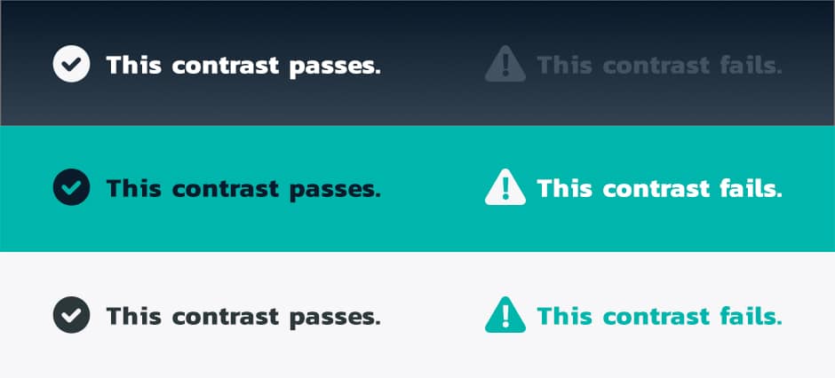
There are several online tools out there to help, but I recommend the WebAIM.com contrast checker in your toolkit. With a clear understanding of contrast, the next step was to look at the color and how it was being used.
#2: Use color correctly
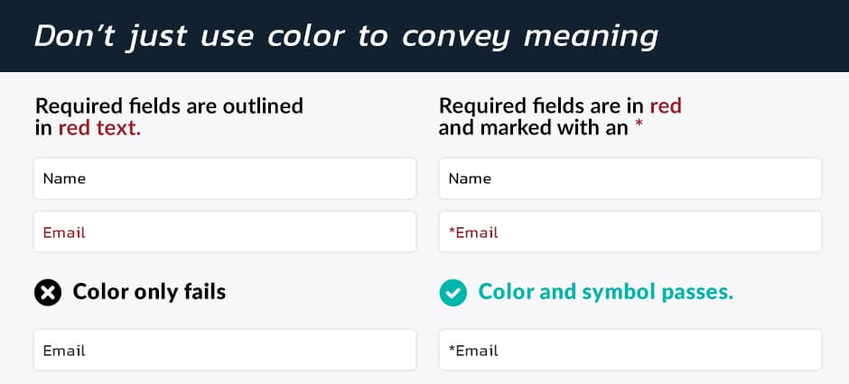
Color is an important aspect of web design as it’s used to convey information and draw the user’s eye to specific areas of the site. When you think about color from an accessibility point of view, it cannot be the only way information is conveyed. You need to use an additional form of visual reference that does not rely solely on color perception.
For example, if a field is required, making the required text a different color is not enough. If someone is colorblind they will not see a difference between the required color text and regular text. By simply adding an asterisk you give the user a visual cue and ensure you are not relying on color alone.
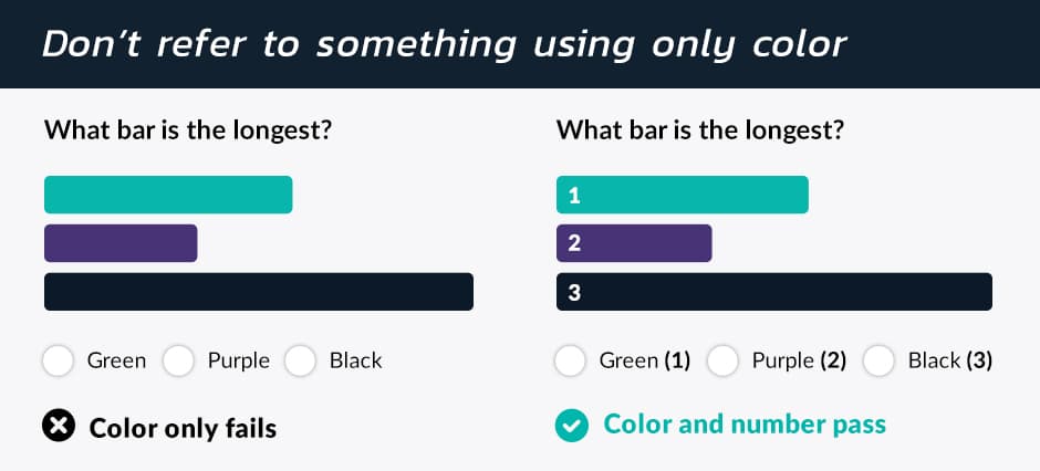
Full-color infographics are a great way to liven up your design. Designing an accessible website does not mean you have to cut back on the design — simply add in numbers or other visual cues to pass your accessibility check.
Understand the various types of color blindness when designing for accessibility
The various types of color blindness are tricky to understand.
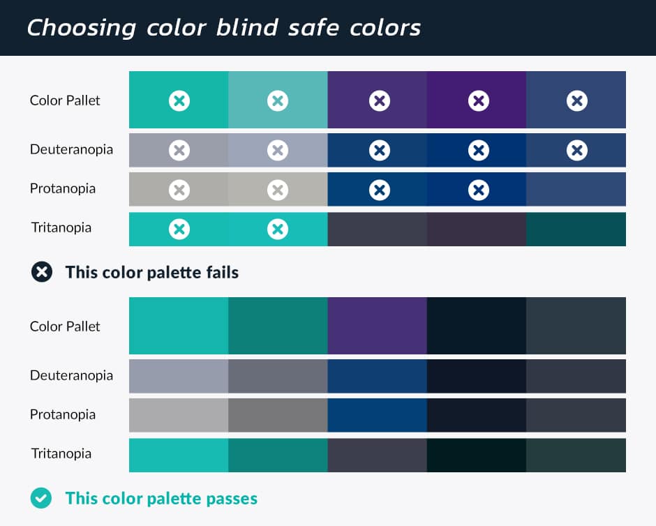
The type of color people see can be completely different depending on the individual. An excellent resource is Adobe Color which has a built-in Color Blind Simulator and Color Contrast Checker. This tool allows one to test what colors look like based on the different types of color blindness. There was a lot of tweaking and testing with the color palette on the QualityLogic website. In the end, the colorblind-safe palette was not that far from the original color palette.
#3: Think differently about the type
Considering type was one of the easiest and hardest shifts I had to make as a web designer. It was easy because the rules are clear and easy to follow.
Key type design rules include:
- Font size for body text should be no smaller than 16pt
- Line height (line spacing) to at least 1.5 times the font size
- Spacing between paragraphs is at least 2 times the font size
- Letter spacing (tracking) to at least 0.12 times the font size
- Word spacing to at least 0.16 times the font size
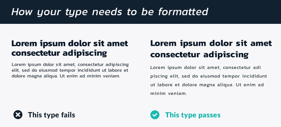
What made it hard was to not look at typography as a design element, but rather consider the type as a way to convey information. It is less about the look of the typography and more important for it to be clear and legible for the largest possible group of people.
#4: Pay attention to headings and grouped content
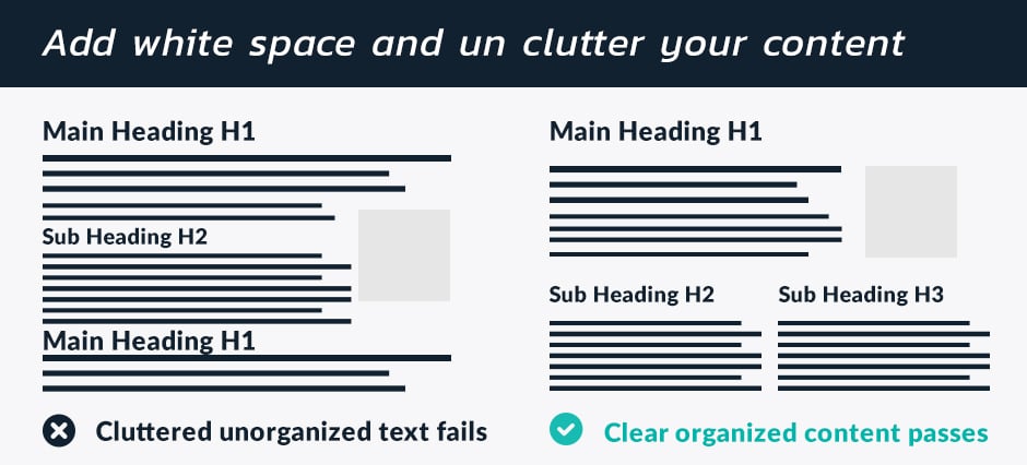
As a designer, this was the easiest set of guidelines to figure out — use more whitespace, create a clear hierarchy with headings, add group content, and reduce clutter. The goal is to make the type easier to scan and understand. This allows the user to zoom in or out on the text and allows screen readers to read your content in the correct order.
#5: Accessible sites must be flexible and easy to manage
When designing for accessibility the design of the website needs to be pretty locked in. When a new page is created it needs to pass all of the accessibility guidelines without any extra work on the client’s end. The challenge on this site was that QualityLogic wanted as much flexibility as possible.
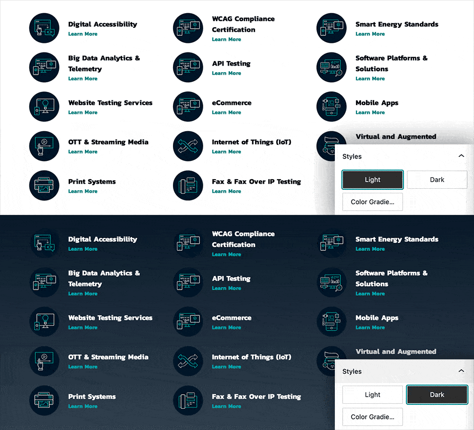
Our strategy was to look at the design elements of the website as reusable blocks. This allowed us to lock in all of the accessible settings so our clients could use the blocks however they choose. We gave them a massive library of choices to use on any page or post.
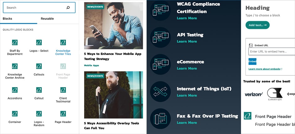
We also programmed the logic to automatically change the styling of the blocks based on the background color they choose. If they change a light background to dark, the styles will automatically change to be accessible on a dark background.
Conclusion
Keep in mind, that the topic of web accessibility is a big one. I have only scratched the surface when it comes to the different accessibility steps we went through with this site. Thankfully, the QualityLogic team tested the site through their digital accessibility testing services to keep us on track. In the end, we have a compliant website that looks good and gives our clients the flexibility they require.
As always, the BrandCraft team is here to help in any way we can. Contact us to see if we’re a good fit for your next accessible web design project.


